
One half-wrap design, built to sit on any van in the yard — giving a growing painting company a clean, professional presence wherever its vans go.
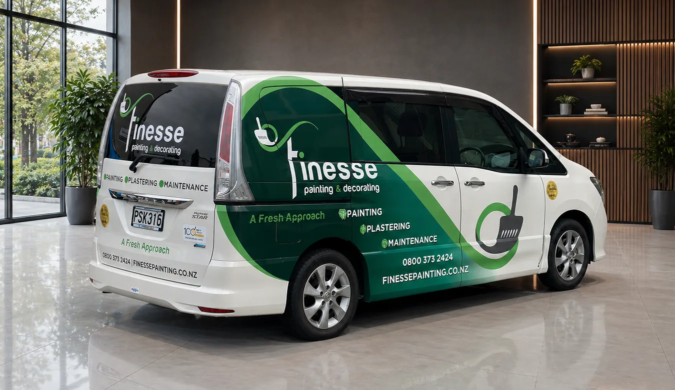
Finesse Painting & Decorating are growing fast, chasing large commercial work under tender. Their point of difference is that every painter on site is their own employee — quality they can actually stand behind, because they picked the people and wrote the procedures.
But their director kept seeing tenders go to management companies who subcontract the work to independent contractors with little accountability for the finish — often turning up in paint-stained, unbranded vans. If Finesse are going to build recognition and become a well-regarded name in the commercial painting industry, their fleet needs to reflect the same level of professionalism they bring to the work.
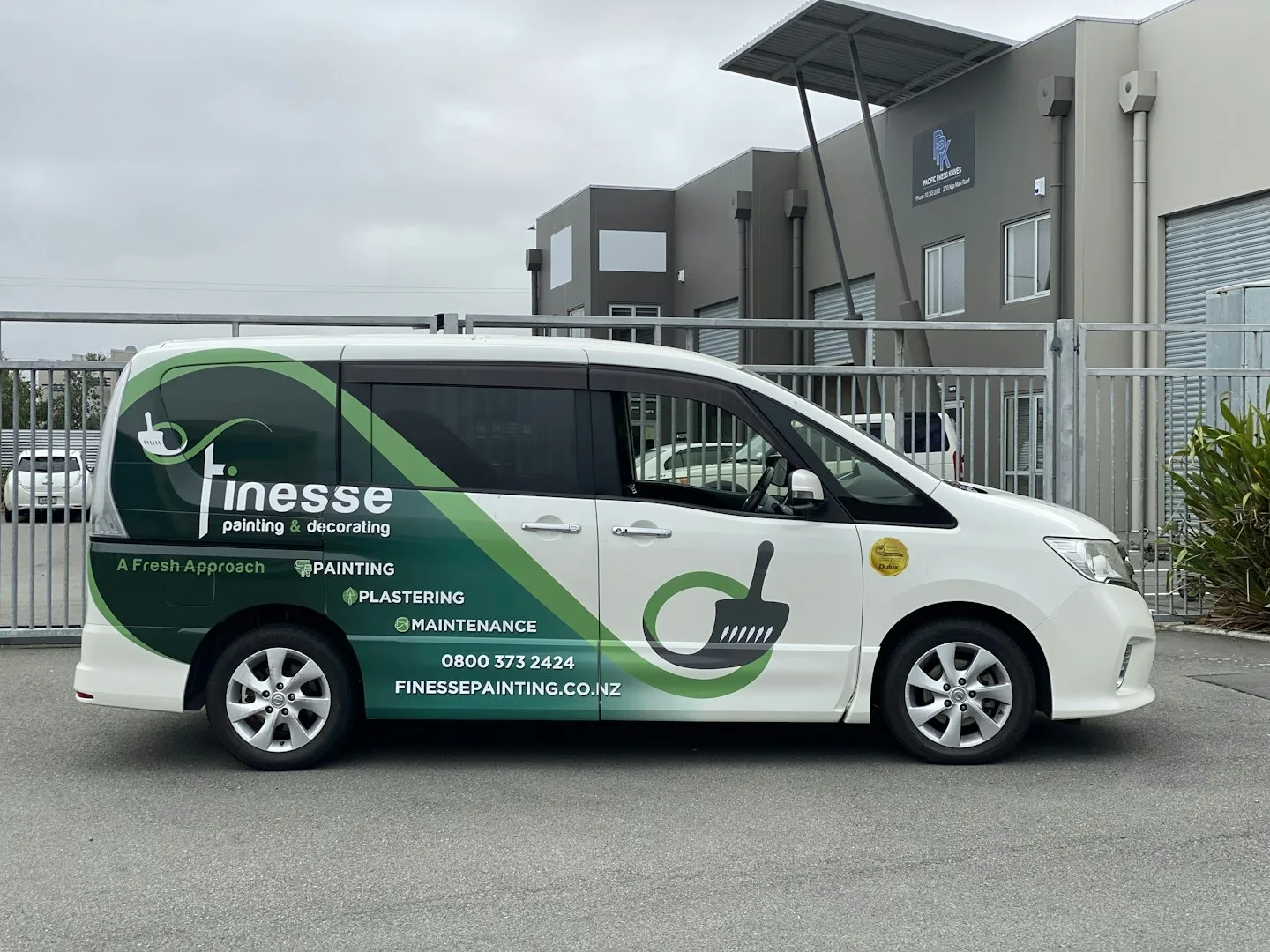
This was never a one-off for one van. We designed an eye-catching half wrap that had to hold together across a whole fleet of different makes and models — whatever they buy next, it already has a home. Same design language, same presence, no starting again.
We pulled the logo apart. The paint stroke swirl that doubles as the F is what defines the edge of the half wrap — everything else fills in behind it. It isn’t a panel with a logo dropped on top. The logo draws the panel.
Finesse normally run dark green on white. We flipped it — dark green ground, white logo over the top — then ran a gradient up to a brighter green and faded it out into the van’s own paint. That gives the stroke room to breathe, creating the impression that it has been cast across the vehicle rather than stuck on it.
There’s a paint roller texture sitting at low opacity through the background. From across a car park it just reads as depth. Walk up to it and you’re looking at the trade they’re in. Small detail, and it’s the kind of thing that rewards a second look.
That stylised F is tall, which makes it awkward to place at a size anyone can actually read. We split the capital through the window line and dropped the rest of the word beneath it, so the lettering remains legible without being interrupted by window rubbers or mouldings, while maintaining the same placement across the different vehicle models. Drop shadows on all the text keep it sharp over a busy background.
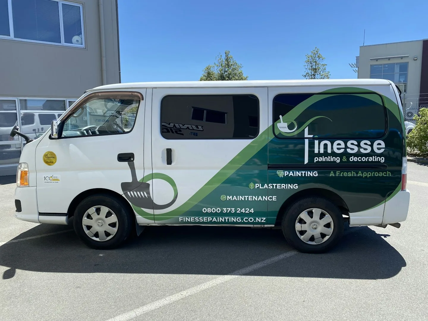
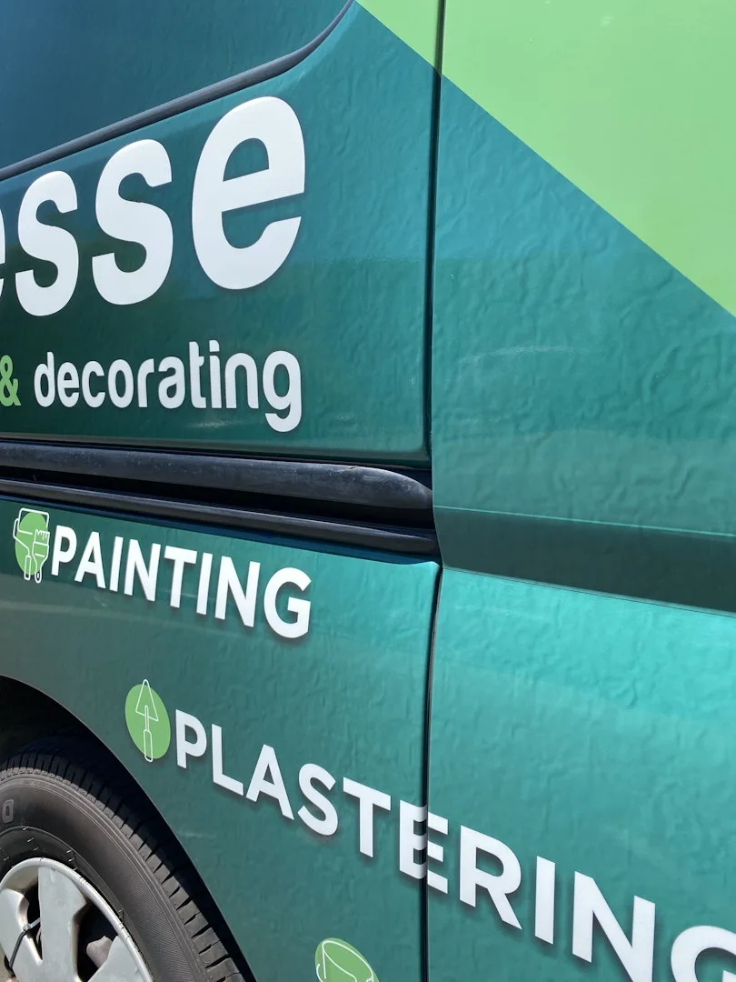
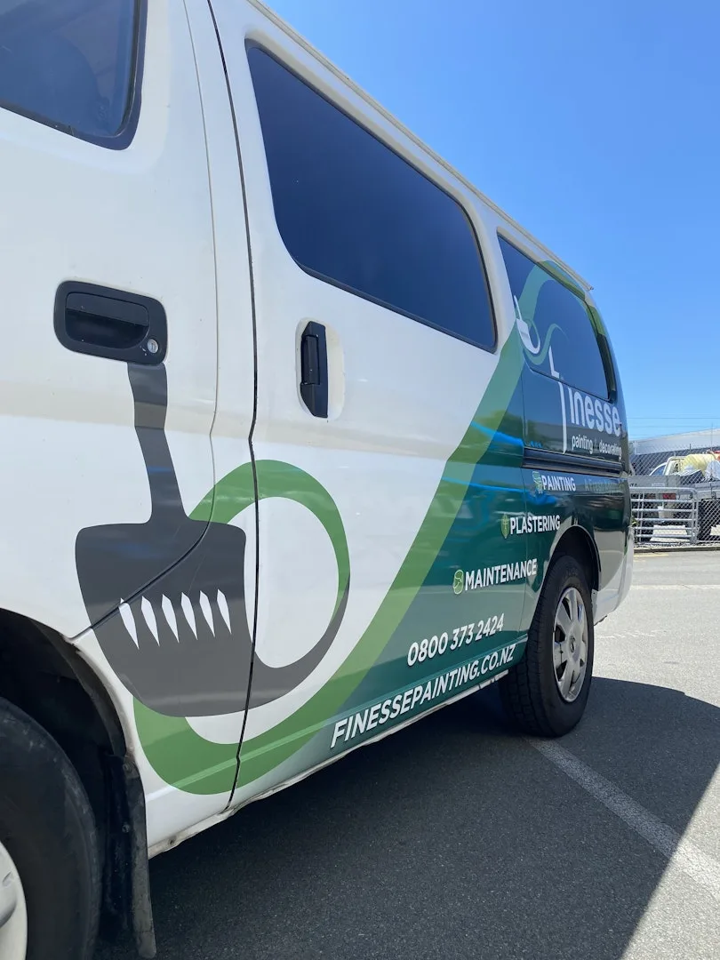
Finesse now have nine vehicles running this branding across Christchurch — a moving presence that does the recognition work long before a tender lands on anyone’s desk. Clean, professional, and unmistakably theirs.