A recovery studio where almost every sign reads as a design element. Illuminated logos painted to match the walls they sit on, windows that advertise and conceal at the same time, and a plan that started before the wiring did.
We came to this one on a referral — the kind that follows years of work for Christchurch’s larger construction companies and shop fitters — and we were engaged early, before the fitout was underway.
The theme was distinctive and the space was classy, which set the problem: signage that fits the aesthetic and does its job, in a place where the entire product is relaxation. Abrupt branding would have undone the experience the fitout was built to create. Every piece had to earn its place.
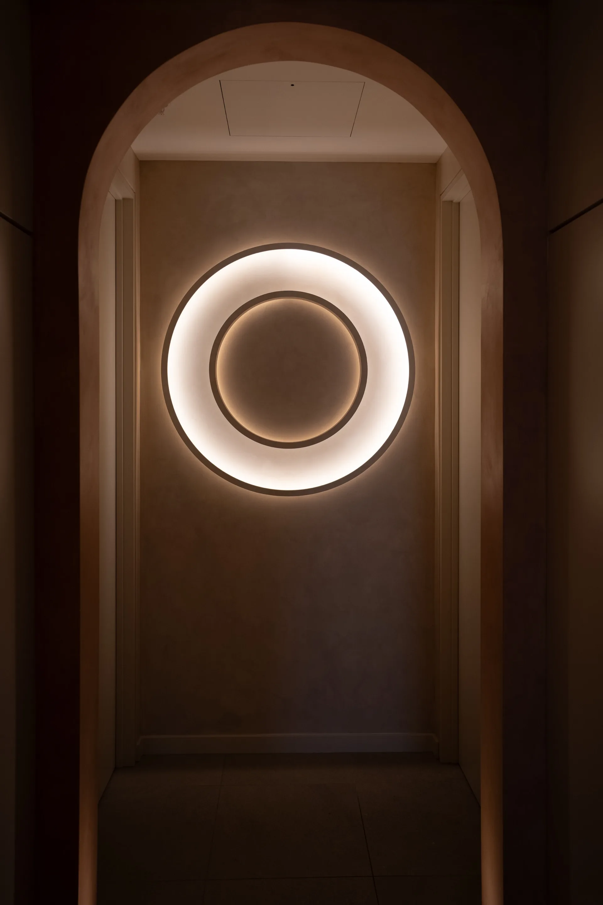
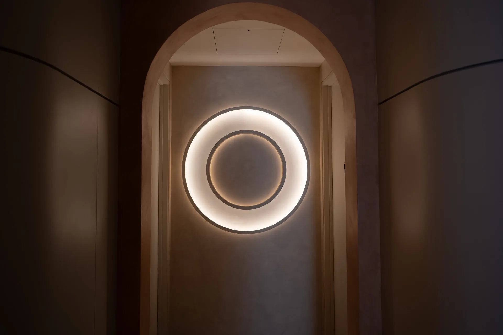
The signature move of the whole fitout. The O-Studio mark appears as soft illuminated forms, finished in the same colour and texture as the wall behind them. A quiet nod to the brand that a guest reads as architecture first and signage second — which is exactly the right order for a space like this.
Face and backing panels CNC-routed from acrylic, then an acrylic side wall fabricated to form the outer shape and glued to both. A sealed unit, built in our workshop, with nothing about it that reads as off-the-shelf.
Strip LED lit, with the lighting concealed in recesses designed into the acrylic itself. You see the glow, never the source — which is the whole difference between a light fitting and a piece of architecture.
Here’s the part most people miss. The signs went up after the walls were painted, and then the painters finished the signs themselves — matching the exact colour and texture of the wall each piece sits on. The logo doesn’t sit on the wall. It emerges from it.
Being engaged early meant cable management for every illuminated piece went into the fitout’s wiring plan, and bracing went in behind each wall to carry the weight. None of it visible, all of it decided before a single wall was closed up.
The illuminated pieces are the ones people remember, but the job ran right across the building — glazing, building identity, wayfinding and safety compliance, all designed to the same brief.
The main identity sign sits inside the building, facing out through the glazing — out of reach of vandalism, and illuminated so it works as a 24/7 advertisement after the doors close. It’s scaled to match the statement wall detail in the lobby, so the two read as a pair rather than as separate jobs.
The full glass frontage had to hide the sauna’s interior framework, give the recovery area privacy, and still advertise the business. The graphics grade across all three: the main sign acts as a border, flows into perforated film that lets people inside see out, then into full coverage over the recovery area, then into blockout prints concealing storage and sauna infrastructure. Occupants keep the natural light and the view. Nobody sees in.
The window design runs on circular, flowing elements — cohesive with a brand built on movement and relaxation — with imagery showing what’s inside. It reads as considered glazing treatment rather than advertising stuck to a window.
Matte black CNC laser-cut acrylic lettering names each room for wayfinding. The manifestation bands required for safety compliance on full-height glazing carry the logo through the complex. Compliance handled as design, not as an afterthought bolted on at the end.
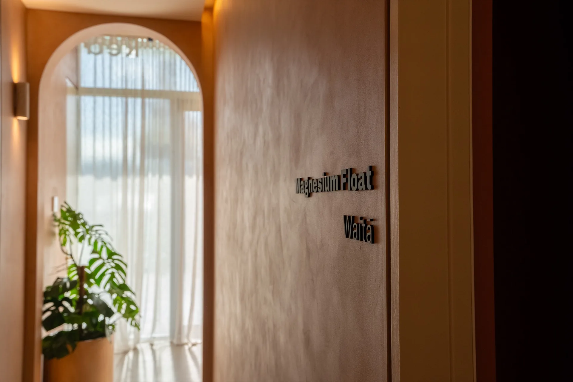
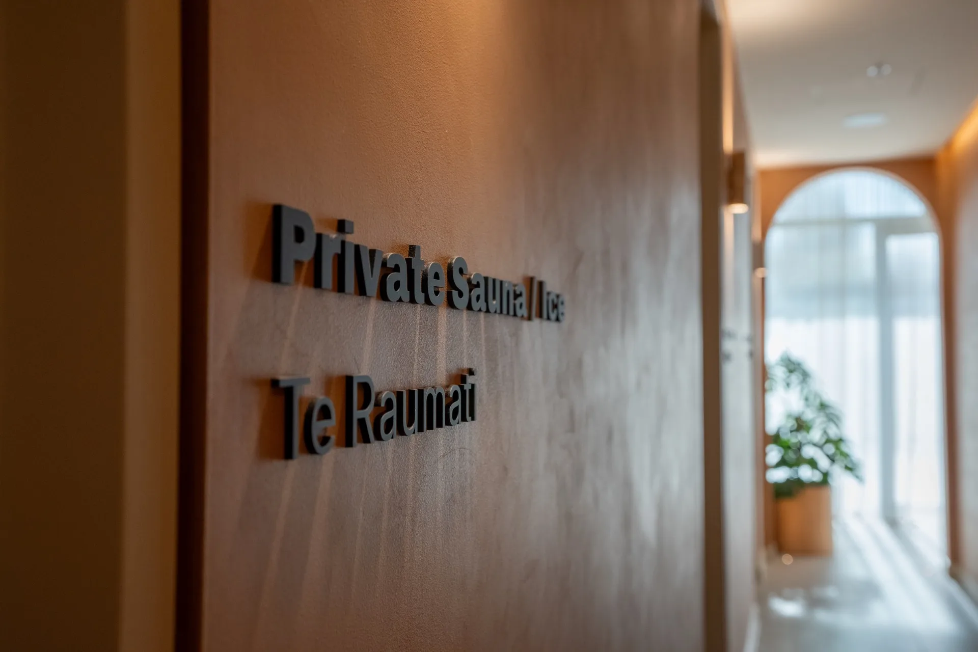
Walk through O-Studio and the signage barely announces itself. The logo glows out of the plaster. The windows read as glazing design. The room names are quiet matte black on a warm wall. Everything is doing its job and none of it interrupts the reason people came.
It also happens to be the most complete demonstration of what we do — illuminated fabrication, window graphics, dimensional lettering, building identity and compliance signage, on one site, from one team.