
Three poles at the school gate that could be mistaken for sculpture. A concept with no working drawings behind it, turned into a built object that looks like it grew where it stands.
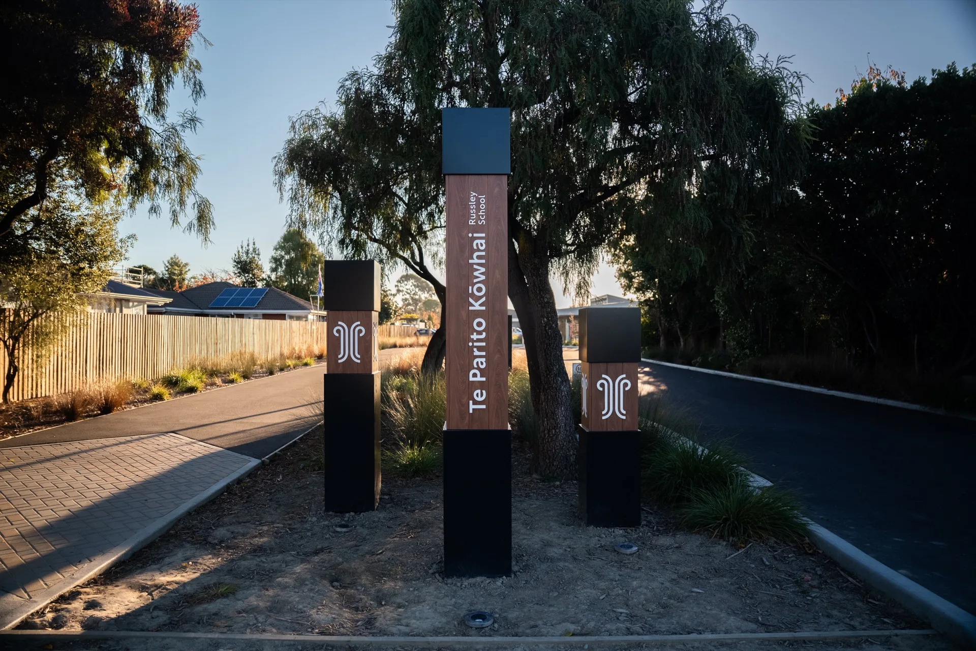
Russley School was being rebuilt to current education standards and rebranded to Te Parito Kōwhai at the same time. Friday Creative developed the new identity — logo, values, colour palette — and the concepts for the piece that mattered most: the sign at the gate. We were brought in by the special projects manager at Hawkins Construction to turn the best of those concepts into something real.
What arrived was a render and an idea. No working drawings, no layout, no specification. Just a strong concept and the question of whether anyone could actually build it. A full circle moment, as it happens — our director went to this school.
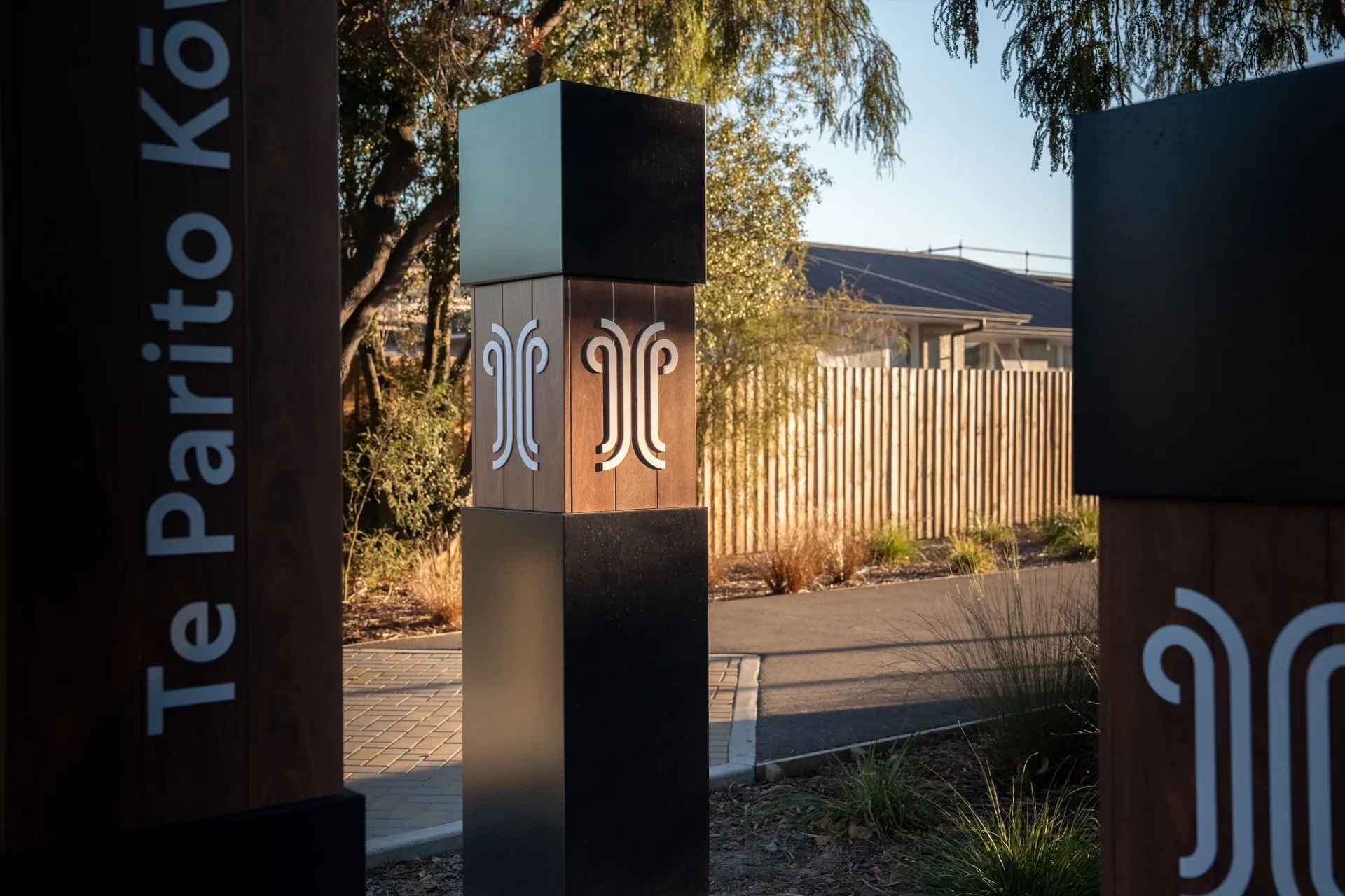
This was never just a name at the roadside. Every part of the concept carries something about the school — which is what made it worth the effort of working out how to build it.
Three poles at three heights, standing for everyone attached to the school — young students, teachers, the wider community. Read another way, the climb in height is the climb through the school itself: growth, maturing, movement.
They sit in a group of three because the kōwhai plantings across the school grounds sit in groups of three. The landmark echoes the landscaping rather than interrupting it.
The outer casing is the school’s brand blue, and it opens to show a timber texture inside. Te Parito Kōwhai means the centre of the kōwhai tree — so the sign is built to be exactly that. Open the outside, find the heartwood.
Real timber was the honest answer and the wrong one — staining around 3D lettering and logo detail forever is upkeep no school should inherit. Printed woodgrain vinyl needed less care but wouldn’t last as long or feel natural. We kept looking, and found the Metwood range through Vulcan Ulrich Aluminium: an aluminium slat extrusion, powder coated with a woodgrain effect, layered so it has the texture of timber as well as the look.
Our preferred panel method. Flat aluminium composite gets CNC-routed V grooves in the back, then folds around a frame into a boxed sign. You get real depth and no fixings visible on the face — nothing competing with the content, and the sign reads as a considered piece of the architecture rather than something bolted on afterwards.
Christchurch City Council bylaws require structural engineer’s drawings above three metres. Keeping the tallest pole under that line — while the available slat sizes dictated how everything else scaled — meant the whole job could proceed without that step. Behind the cladding sits a 100mm SHS steel post with a 25mm box-section subframe, galvanised for longevity, on fabricated base plates dropped into concreted ground cages.
There was pressure from more than one direction to illuminate the lettering. We argued for spot lighting instead — light thrown up the object from outside, the way you’d light a tree, rather than glowing from within. It keeps the whole thing natural after dark, which was the entire point.
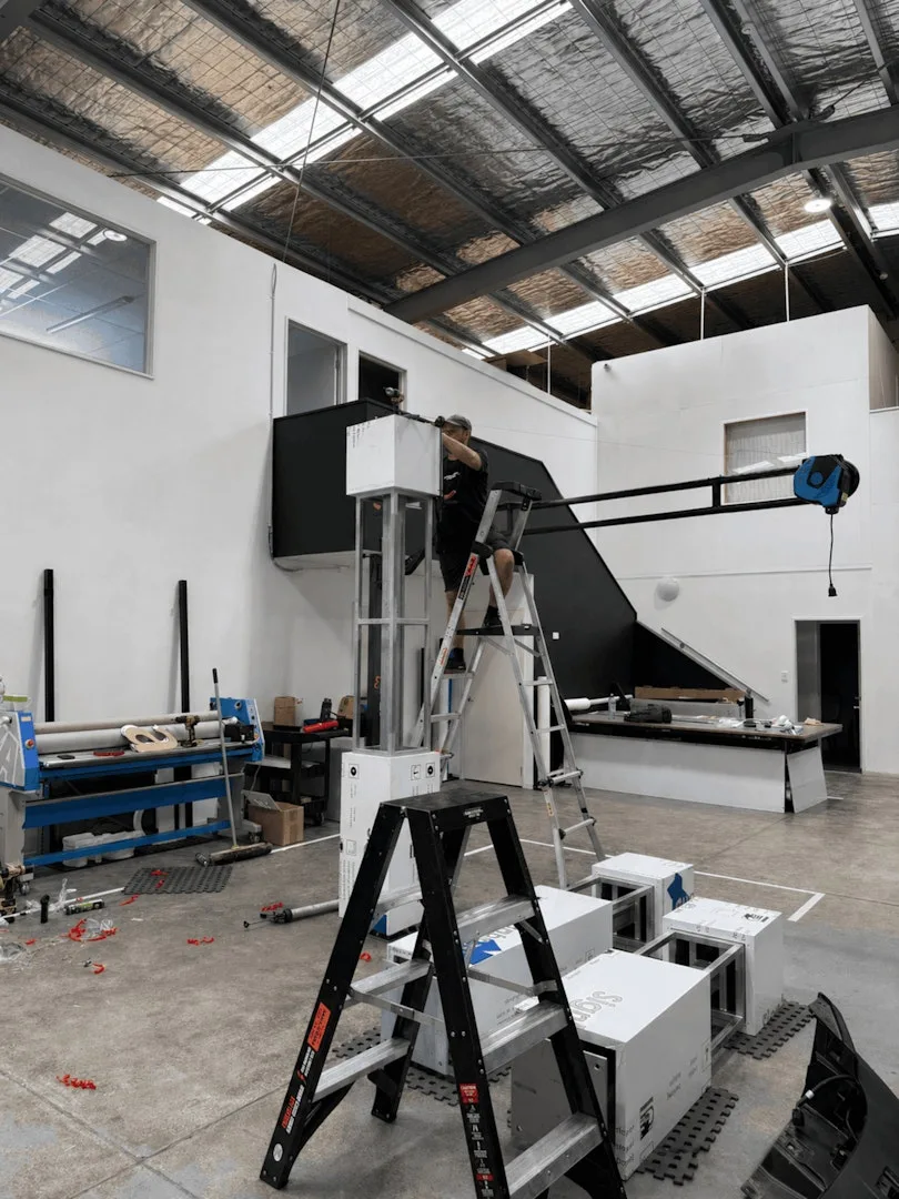
Plans were drawn in-house. Frame fabrication and the two-pack painting went to specialists set up for it, then everything came back to us to assemble, clad and install. Slats back-screwed to the composite boards, boards onto the structure, 3D laser-cut acrylic logos last.
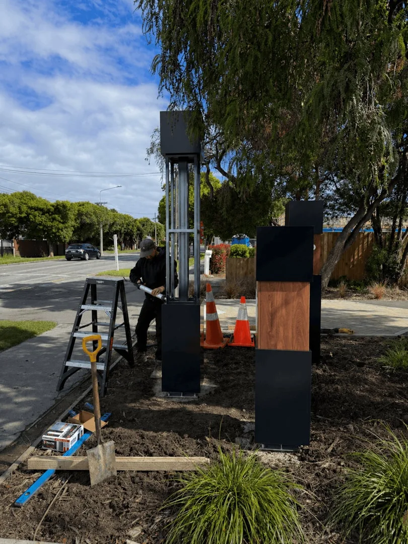
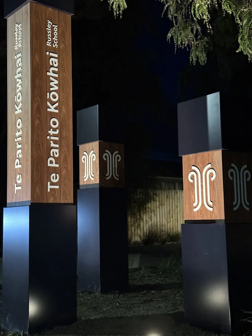
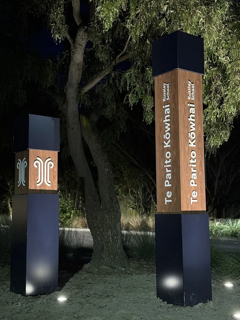
Footings covered in mulch, flaxes and trees planted around them — the poles read as something that came up out of the ground rather than something delivered on a truck. Which is the right note for a school whose pupils do much the same thing.
The same boxed-panel method carries through the signage across the rest of the site, so the landmark at the gate and the wayfinding inside the grounds belong to each other.